Pages

Sunday, September 1, 2019

Power BI + Oracle PBCS - Part 3: Hierarchical reports

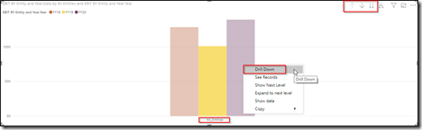
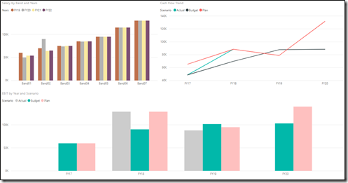
After I wrote the other two posts and shared the same with few of my colleagues, a lot of question poured in asking ‘How about this..?’ or ‘Can we do this…?’, etc and one question asked by our very own Hyperion Jedi (Ahmed Hafez) left me intrigued looking for answers to ‘Can we have hierarchy driven report in Power BI when connecting to PBCS?’ This kept me busy for a few hours with an outcome, the snapshots of which look something like below. The first chart shows the top-level entity roll-up ‘All Entities’, providing an option to drill-down to BUs. The same action can be performed on BUs to lead to entities.
image
image

Let’s look at the steps to achieve the required hierarchical structure. I would not talk about the steps to connect Power BI to PBCS and how to parse data, rather suggest to go through Part 1 and Part 2 of this post. In past posts, we utilised the concept of calling PBCS export data slice web service to pull data and parse it. In addition to pulling data slice, we would also need the metadata hierarchy and its parent-child relationship to define the roll-ups. This can be achieved using the ‘Get Member’ endpoint of the REST API.

URL: https://<<service-name>>//HyperionPlanning/rest/{api_version}/applications/{application}/dimensions/{dimname}/members/{member}

The api_version is V3, dimname is the dimension from which member information needs to be extracted and the member is the member name. Interestingly, this service returns the entire dimension structure if we provide the top member of the dimension as a member name. The response is a nested JSON response which keeps going one level down when a member has children.
It starts from the first step on the left and applying all the steps in the second snapshot, give the output as a flattened hierarchy or in Essbase world, a generation layout extract. The query was saved with the name ‘Entity Metadata’.
image
image
image

In Power BI, we can convert columns of a table into a hierarchy by right-clicking on one of the columns and choosing ‘New Hierarchy’ option. This would lead to the creation of the hierarchy as ‘Entity_Hierarchy’ starting from Entity dimension name, roll-up member All Entities, followed by BUs and finally leaf entities.
image
image

As discussed in earlier posts, we would now need to pull our entity data. In this case, we pull EBIT data by entity and Year to give us the below data table. We pull only the level zero entities as the hierarchy aggregation will be handled by Power BI internally.
Note: I am not a Power BI expert to claim the described method is best and their could be more efficient ways to achieve the same.
image

We can now set up a relationship between the two extracts – entity metadata extract and the EBIT data extract by entity and year. This can be done by merging the two data queries and create a new table. On editing an existing query, we have an option of merging queries as a new. We merge the
image
image


After merging, the data and year from the merged query and the hierarchy is dropped on the visual to get the desired results.
image

The bar chart in this example will be a hierarchy driven chart giving options to drill-down or drill-up and view the results. At the same time, this can be also managed through the drill-don and up buttons on the chart.
image

Ta-da !!!

Its important to pay attention to the volume of the data handled with such integrations. In my opinion, we need to pull only that data what we need to show on the chart rather than pulling the entire cube. This can be broken down into multiple data sources and used together on the chart by establishing a relationship between data sources. Pulling large volumes might hit performance and can be avoided by breaking down the data into multiple data sets. Moreover, I haven’t tried experimenting with ragged hierarchy and need to see how it can be achieved.
Cheers !!!

Power BI + Oracle PBCS - Part 2: Connect and Visualise

This post is in continuation to Part 1 of the same topic in which I talked about how PBCS REST APIs can be used to pull data as JSON response. We used the Postman app to view our results. In this post, we will see how we can make a call to an HTTP POST request and parse the JSON response within Power BI.

Note: I am not a Power BI expert and method shared herein is one such way of doing this. There might be more efficient ways to achieve the same where Power BI experts can help.

Power BI offers a lot of inbuilt connectors and methods to pull data from discrete sources and they serve the purpose perfectly. But in certain cases, prebuilt connectors do not serve the purpose and that’s when “Blank Query” brings out its magic, helping to connect to anything which can be defined in Query terms. Because Power BI’s Web connector makes an HTTP GET request by default, we cannot use it to execute our data slice REST API which is POST in nature. Thus we use the Query to enable Power BI to make an HTTP POST request.
image
image

In the blank query connector, we have “Advanced Editor” where we can define the query to pull data from PBCS. There is a specific way to define the query and provide the required parameters. A blank editor comes up as shown in below snapshot and we need to define what should go in each section.
image

Taking the same cash flow example, we define the authentication key and the request body what was passed to the POST request. This is where I find Postman app quite handy as it can provide an encrypted key for the password which we used when attempting to make a request and this encrypted key can be used in a query without compromising the actual password.
After you receive a successful response in the Postman app, click on the code option under the Send button. This gives the user an option to generate the code in various languages. Under each option, you could find the header content which was sent with the HTTP POST request. In the below example, it shows the payload that was used and the authorization key indicating that Basic authentication was used.
image
image

The query has 2 parts, first the authentication key and content (which is the request body JSON, we submit with HTTP POST request) and the submission of request using Web. Contents method. Since the JSON we submit with HTTP POST request have all member and dimension names wrapped in quotes, in order to pass the quotes with the request, we need to wrap the member and dimension names within double-quotes.
image

On hitting Done, it will return the JSON response and I like the way its quite easy to parse the JSON response into a tabular structure which I explain in following steps.
  1. It returns three groups of the response – POV, Columns and Rows. Since the POV and Column members were fixed, we will be expanding Rowsimage
  2. Power BI uses Power Query to do this parsing. In case you have not observed, Power Query is also available in Excel to pull data from different sources and the same actions can be performed there too. Power Query uses DAX language to perform all these steps. Nice thing about this is that you can view all the steps on the right pane and can go back to any step when required and start over. The step 1 above would produce list objects with all the recordsimage
  3. Convert this into a table using the option on top left cornerimage
  4. The available table has one column, which needs to be expanded using the button at top of the table image
  5. Expanded columns are further expanded one by one and from the option choose “Extract Values”image
  6. This would pop-up a window. Choose a delimiter to delimit members from multiple dimensions. For the header (first) column, choose the option to choose a delimiter. I this case I chose | (pipe) delimiter, but anyone of available options or custom option can be used. Do not choose any delimiter for the data (second) column image
  7. If we look back in the request body, we used scenario and year dimension on rows and the response returned members of both dimension in rows. When using the delimiter, we can easily split the members in the following stepsimage 
  8. Right-click on the headers (first) column and choose split column –> By Delimiter and choose |(pipe) to split the contents into two separate columns. Similarly, the data column is text and should be converted to values to be used on charts. Right-click on data (second) columns and choose option Change Type –> Decimal Numbers to convert them into numbers. We can also rename the columns to help identify them when using on chartsimage
  9. All the steps are captured in the editor on the right pane and we can name this query a relevant name so it can be used as a source. In this case I renamed it from Query2 to Cash Flow Dataimage
  10. Choose the option “Close and apply” to save it as a data sourceimage
  11. At this point, it may prompt validation of credentials, select edit credentials option and then choose Anonymous in the subsequent window to connectimageimage
  12. Similarly, other queries can be created to pull required data from PBCS and used in different charts to give a pretty dashboardimage_thumb5[4]

Since the data is being pulled using web services, every time Power BI dashboard is refreshed, the query sends a request to PBCS to pull real time data. Moreover, the data from various other sources can be viewed together in single dashboard. This provides ability to bring Actual and Budget data from all possible sources at one place making the decision making easy.
Cheers!!!

Power BI + Oracle PBCS - Part 1: REST API Structure

“Visualization gives you answers to questions you didn’t know you had.” – Ben Schneiderman.

Undoubtedly, visualization is playing a vital role in today’s corporate world. The data is no longer confined to tables or worksheets, be it a CXO or analyst, its far easy to consume information and report via pretty visuals knit together into colourful dashboards. This has lead to an upward trend of visualization tools like Oracle Analytics Cloud (OACS), Microsoft Power BI, Qlik Sense, Tableau, etc.

With each product bringing its own benefits to the table, it is important for the firms to invest in the best and harness each product’s capability. PBCS might be a leading planning and budgeting SaaS application but doesn’t offer all dashboarding capabilities or the varied charts available with Power BI. Similarly, Power BI or OACS are best for dashboards not for planning and budgeting. Not all firms invest in OACS with PBCS and tend to have a heterogeneous architecture of BI products. Thus, it is important that these products talk to each other in real-time and this post demonstrates how it can be made possible using Web Services.

One fine example of such dashboard is below developed in Power BI and connected to PBCS to pull data in real-time.
image
Oracle PBCS offers REST APIs to perform import and export of data slices, its documentation can be accessed here. I will be using the Postman app to show how the request is made and what response we receive. I personally like the Postman app (REST API client) as it is quite developer-friendly and helps to generate a lot of code beforehand. You can though use any REST API client available.
Firstly, let's understand the PBCS request structure. Each HTTP request uses certain method to interact with web services, and export data slice uses the POST method. We can read about these methods in detail from the W3Schools page.

URL:Https://<service-name>>/HyperionPlanning/rest/{api_version}/applications/{application}/plantypes/{plantype}/exportdataslice

The api_version currently is V3 and the application and plantype should be replaced with the relevant PBCS app and the plantype from which data needs to be fetched. The parameters required or optional are available as part of the documentation with a snapshot below.
image

In the below example, I post a request to fetch data for cashflow_amount for the year FY17 to FY20 across my scenarios – Actual, Plan and Budget. On the Postman app, you need to choose the method as POST, provide the URL as per the defined structure above, provide authorization details (choose Basic authentication and provide user name and password) and request body which defines what data is requested.
image

The response that we get is something as below. Since the response JSON is nested JSON with multi-level collections, the best way is to put those dimensions on rows which need to be displayed on the chart in the dashboard. In this example, I have put Year and Scenario on rows as I like to display my chart comparing cash flow amount by years.
image

Similarly, we can fetch data for different data slices from PBCS as JSON response which can be easily parsed in Power BI. In the following post, I will talk about how we can parse this response in Power BI to populate charts.
Note: Neither I have any affiliation to Power BI or Postman app, nor do I promote their use. I created these examples as a technology enthusiast to showcase what’s possible.
Cheers !!!